
The web is all about speed nowadays. If your page takes more than average to load, visitors will bounce without any regrets. Of course, the response time of your web server plays a major role as well as browser caching and minifying source files and scripts. But the big thing - literally - to gain those vital Google PageSpeed points, is to optimize your images. And I don't necessarily mean 'Save for web' when exporting your jpeg's. That's something you always have to do. I'm going to talk about responsive images.
I'm not gonna bore you with a long story about the theory behind responsive images, nor am I going to talk about the potential profits for the page speed. Instead I will use one of our latest projects as a real-world example to explain how I implemented responsive images in practice. Here we go.
The case: FEM-FEM.nl
I've been reading quite a few blog posts for good examples and best practices on how to efficiently scale my images. All of these were quite basal and didn't really cover a situation like I had with a lot of different breakpoints and image variations.
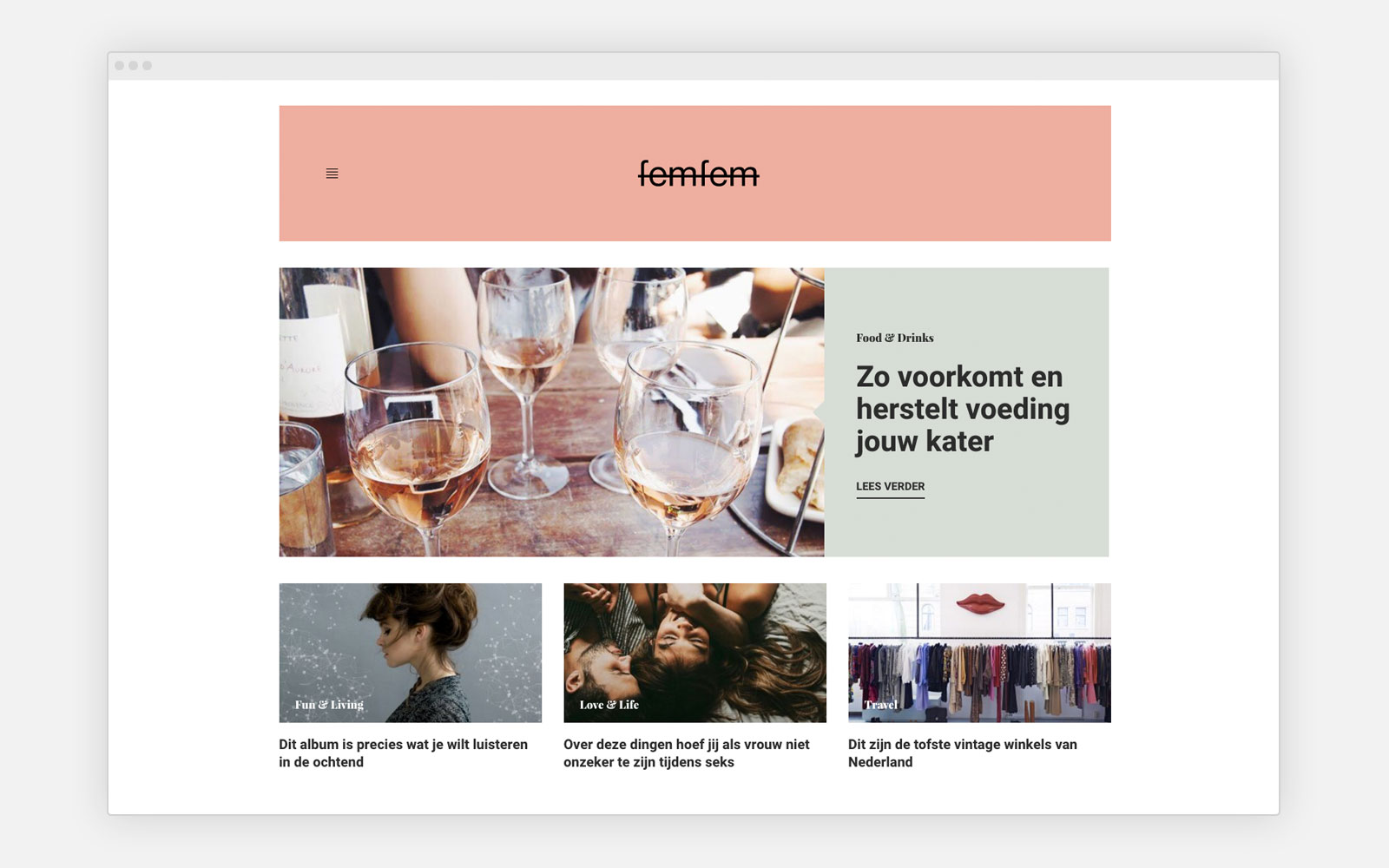
Here's how I solved this problem for the website FEM-FEM.nl, which we launched mid september. FEM FEM is an online magazine for young women who want to develop themselves in terms of career, health, style and happiness. The design of the website is (of course) very visual. To make sure all these images won't affect the time it takes the page to load too much, implementing responsive images was essential.
Srcset and sizes
Since I'm just changing resolutions, I found out srcset and sizes where the best way to get the job done. Srcset and sizes are two powerful attributes of the
- Which image sources, or files, your site has available (
srcset) - What the rendered width of the image will be at certain breakpoints (
sizes)
The browser combines this information with the stuff it already knows, like screen width, pixel density, device type, slow bandwidth, etc. It now has the perfect set of ammunition to fire the right image at the user. Super clever!
Getting into it!
Beforehand, it's good to note that FEM-FEM.nl was build using Wordpress. Because we need a lot of different versions of the image, it saves us a lot of time to let Wordpress create these versions for us using the add_image_size() function.
To make it even easier, we used a Wordpress plugin called Fly Dynamic Image Resizer to dynamically create image sizes on the fly. Check it out yourself as I won't cover the functionality of that plugin in this post.
First step: defining the media queries
Here's the source code of the first featured post on the homepage.
<img src="//placehold.it/700x370" alt="Alt text" srcset="//placehold.it/1200x634 1200w, //placehold.it/700x370 700w, //placehold.it/340x180 340w" sizes="(min-width: 1200px) 740px, (min-width: 768px) 700px, calc(100vw - 36px)">
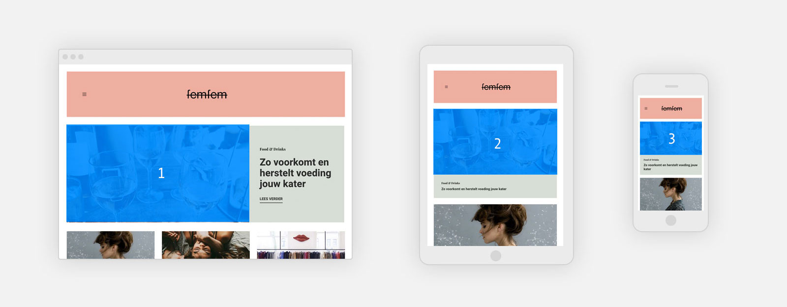
Let's break this down and first look at the sizes. Right here we're going to tell the browser what the width of the image will be at certain breakpoints. Since I used Bootstrap as my front-end framework, these are my breakpoints:
- Extra small devices (phones, less than 768px)
- This is the default, no media query
- Small devices (tablets, 768px and up)
-
@media (min-width: 768px)
-
- Medium devices (desktops, 992px and up)
-
@media (min-width: 992px)
-
- Large devices (large desktops, 1200px and up)
-
@media (min-width: 1200px)
-
Now what I did was simply check the width of the image at each breakpoint.
Important: for some reason the order in which the breakpoints are declared in the sizes attribute matter! It's sort of looking up the breakpoint hierarchy. So first we check the width of the image at the widest resolution and then look for the lower ones.
At viewports of 1200px (1) and wider the width of the image is 740px. For 992px and 768px (2) the width is set at 700px. For all devices smaller than 768px (3) the image will spread across the full width of the viewport, except for the 18px gutters on the left and right side. This results in the following source code:
sizes="(min-width: 1200px) 740px, (min-width: 768px) 700px, calc(100vw - 36px)"
You can see the last declaration has no media query. That's because this is the wildcard. So if any of the other media queries don't match, it will check for this last value. You can see I used the surprisingly well supported calc() property for this wildcard. You can use this in your CSS as well, just like vw, which stands for 'viewport width'. Really useful for this matter.
Step two: creating the srcset
Next, we're going to give the browser a few versions of the image and map them out in the srcset. Again, pay attention to the order in which you define them!
It's good to know that we don't need to supply ALL of the exact image sizes as they will be rendered on the site. The browser doesn't need tens of different versions of the image to properly handle the responsiveness. In my example it might feel as if I've done a bit of guesswork. But let me explain why I chose the following three image variations as shown in this source code:
srcset="//placehold.it/1200x634 1200w, //placehold.it/700x370 700w, //placehold.it/340x180 340w"
The largest image I supplied has a width of 1200px. This image will be nice and sharp on large screens with a high pixel density. I could've set an image of 1480px wide (@2x the largest rendered width), but that would've been a few hundreds of kb's extra to load and this 1200px image still looks great on a MacBook Pro with a Retina display.
The 700px image exactly matches our second media query. This same image will also be used on retina display smartphones. I.e. on an iPhone 6 or 7 it will render at a width of (375-36)*2 = 678px. Close enough, right?
The browser will use that last image of 340px on non-retina smartphones (do they still exist?).
Important: as you've hopefully noticed, the widths in the srcset are declared by using the w descriptor, which represents the width of the file. I initially made the mistake by putting px there just to leave myself wondering why it wasn't working.
Still use src!
You can see the src attribute is still mandatory. This is a fallback for a browser that doesn't support srcset and sizes. I guess you're not surprised this browser turns out to be Internet Explorer :-). Right here you want to pick a version of the image that looks good on all screen sizes and devices. I used that 700px image again:
src="//placehold.it/700x370"
Test it out!
So now's the time to check if everything's working properly. I've chosen to take Placehold.it images to make it easier to find out which version of the image is presented. These placeholder images show the dimensions of the file as text on the image. Very helpful.
Really important note!
Your browser is caching all the images it's been using. So if you first take a look at your site at the largest size, the browser already loaded the largest version of the image. Meaning that if you now make your browser smaller, it's still going to show that 1200px image! This makes sense because it's the 'best' version of the image. And since already been loaded, there no reason to not show it. This is smart but it can put you on the wrong track.
It took me a while to figure this out. To tackle this problem I opened up an incognito window of Google Chrome, resized the browser first and then loaded the URL. You can now slowly upscale your browser's width to see the different versions of the image appear. Cool huh?!
Srcset and @2x
There's another cool feature of srcset. Further down the homepage of FEM-FEM.nl I got a few fixed-width images for the articles in the categories.

Because this image is always 225px wide, I'm just going to use srcset to support high pixel density displays. This is where 1x and 2x (and optionally 3x and 4x) come in handy. It's important to know you can't (and don't need to) use sizes in this case.
This leads to the following source code for that image:
<img src="//placehold.it/225x120" alt="Alt text" srcset="//placehold.it/225x120 1x, //placehold.it/450x240 2x">
The HTML is pretty straightforward. In the src we declare the fallback image. I used the most lightweight version of the two. In the srcset we use 1x and 2x to tell the browser which of the two it's going to need for high pixel density displays. The reason we don't need to declare sizes is because we already make the decision here for the browser which image it's going to need. Hence the fact that this image is always 225px wide.
Check it out for yourself!
I hope you get an idea on how to use srcset and sizes to nicely scale your images across various breakpoints. Feel free to take a look under the hood of FEM-FEM.nl and see how I handled the different image sizes.
If you have any questions, feel free to drop them in the comments!
Resources
- CSS-tricks.com - Responsive Images: If you’re just changing resolutions, use srcset
- MartinWolf.org - The new srcset and sizes explained
- AListApart.com - Responsive Images in Practice
- EricPortis.com - Srcset and sizes